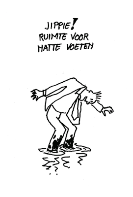
The written text in a graphic story is often as important as the images. It is expected that the graphic artist also has a good hand in writing out the letters of the text. Not me! I was never any good at lettering. I was so bad that the publisher of ‘Moord in Iran’, my graphic novel set in Iran decided to hire somebody to write the text into the balloons and frames. Unfortunately his style of lettering didn’t correspond with my style of drawing at all. It was a hard lesson. No more pussy-footing. From then on I taught myself to write well. In the 20 or so years I worked as a cartoonist I did a lot of lettering. It became second nature to me. However after I was 65 I noticed that my lettering became more shaky. All my life my hand had had these funny little spastic jerks and trembles. For and outsider it often looked horrifying to see me DIY-ing. On paper I had never trouble drawing a straight clear line. But after a certain age the jerks and trembles also started to appear on paper. In particular in my lettering. As a cartoonist I would draw straight on paper, scan it and if necessary work it out in Photoshop on the computer. Actually more and more of the actual work was done on the computer. Why not have a font made of my own lettering? There is software you can download for free that makes a Font out of your writing. You print out a template and draw in with a marker the alphabet. Not me. I couldn’t get my jerky, shaky hand to write into the small frames on the template. The letters were all over the place. I had to hire somebody to make a font out of my lettering. It didn’t come cheap, but it was just in the nick of time.
